
Colour Psychology in Advertising and Branding
By Alvena Ode, Founder & CMO, Blastily · 3 min read
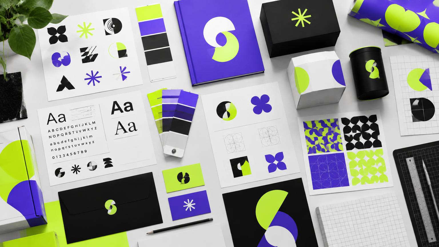
Colour is often the first thing people notice about a brand, and one of the fastest ways they recognize it. Colour psychology in marketing helps you choose colours that attract attention, fit your personality and stay memorable. But it's more nuanced than "blue means trust." Here's how to use it well.
This guide is part of our brand identity series.
Common associations (with caveats)
| Colour | Common associations | Often seen in |
|---|---|---|
| Red | Energy, urgency, passion, appetite | Food, retail sales, entertainment |
| Orange | Warmth, friendliness, value | Consumer brands, calls to action |
| Yellow | Optimism, attention, caution | Signage, youth, value brands |
| Green | Nature, health, growth, money | Wellness, environment, finance |
| Blue | Trust, calm, competence | Finance, tech, healthcare, B2B |
| Purple | Creativity, luxury, imagination | Beauty, creative, premium |
| Black | Sophistication, power, luxury | Fashion, premium products |
| White | Simplicity, cleanliness, space | Health, tech, minimalist brands |
These are tendencies, not rules. Meaning shifts with shade, context, category and culture.
Context matters more than the colour
- Category: green feels natural for a garden centre, less so for a steakhouse.
- Competitors: if every competitor is blue, a different colour helps you stand out.
- Culture: meanings vary across cultures, so consider your audiences, especially in multicultural Canadian markets and abroad. See culturally relevant campaigns.
- Personal experience: people bring their own associations.
Choosing a brand palette
- Start with your personality (bold, calm, premium, playful). See brand identity.
- Audit competitors and look for space to be different.
- Pick one or two signature colours that can become distinctive assets.
- Add supporting colours and neutrals for flexibility.
- Test in real uses: website, signage, billboards, social, print.
Contrast and accessibility
- Ensure text contrasts strongly with its background for readability and accessibility (web accessibility guidelines give specific contrast ratios)
- Don't rely on colour alone to convey meaning; some people have colour vision deficiency
- For billboards, test in greyscale: if the message disappears, contrast is too low (billboard design)
Colour in ads and calls to action
- Make your call-to-action button stand out clearly from the page
- Use your signature colour consistently in ads so people recognize you before reading
- Consider Canadian conditions: white-heavy outdoor designs can blend into snowy backdrops
Colour and accessibility checklist
- [ ] Body text meets recommended contrast ratios against its background
- [ ] Links and buttons are distinguishable without relying on colour alone
- [ ] Charts use labels or patterns, not just colour
- [ ] Brand colours tested on screens, print and outdoor formats
- [ ] Palette reviewed in greyscale
Testing colour choices
Run A/B tests on digital elements like buttons and banners, but test contrast and clarity rather than chasing a "magic" colour. For brand-level decisions, show options to your target audience and ask which feels most like the personality you want, then commit and stay consistent.
Consistency is the real power
A colour becomes "yours" through consistent use over time. Changing colours every campaign throws away recognition. See brand consistency and advertising psychology.
Frequently asked questions
Does colour really affect buying decisions?+
Colour influences attention, recognition and first impressions, but its meaning depends heavily on context, culture, category and personal experience. There's no universal 'best' colour.
What's the best colour for a call-to-action button?+
The one that stands out clearly from the rest of the page while fitting your brand. Contrast matters more than any specific colour.
Do colours mean the same thing in every culture?+
No. For example, white is associated with weddings in many Western cultures but with mourning in some East Asian traditions. Consider your audiences, especially in multicultural markets and international campaigns.
How many colours should a brand use?+
Usually one or two signature colours, a few supporting colours and neutrals. Fewer colours used consistently build stronger recognition.
Work with Blastily
Want this done for you? Blastily plans and places PR, press releases, radio, TV and out-of-home campaigns for growing brands across Canada and beyond.
Talk to BlastilyKeep reading
- Brand Identity: How to Stand Out in a Crowded Market5 min →
- Emotional Branding: Building Loyalty Through Meaningful Connections3 min →
- The Psychology of Advertising: What Drives Buying Decisions3 min →
- How to Create Ads That Convert: Tips for Small Businesses3 min →
- Brand Consistency Across Every Touchpoint3 min →